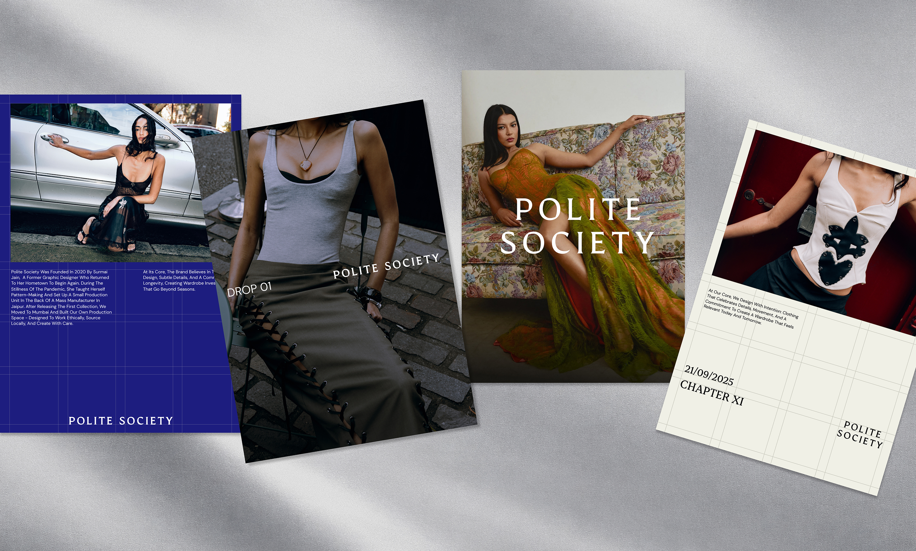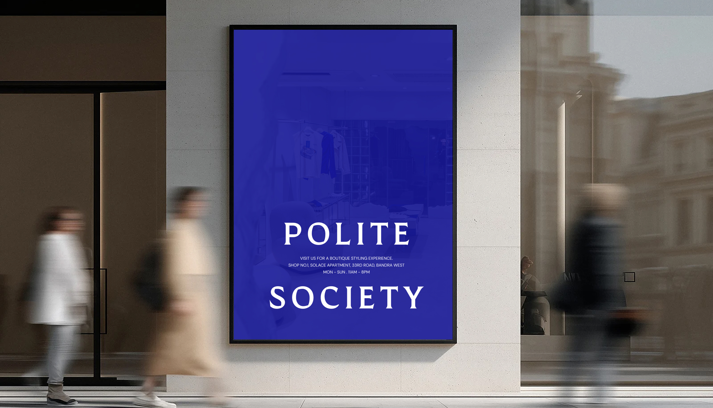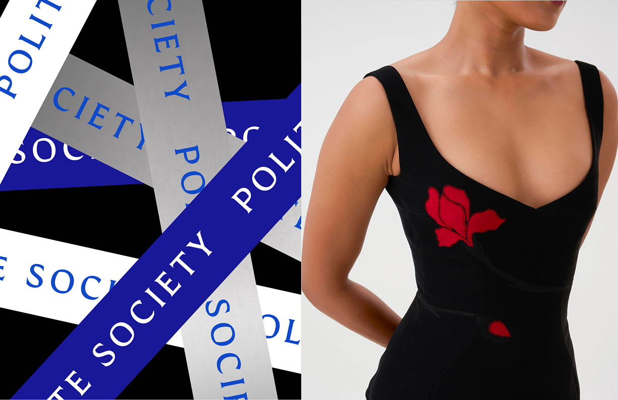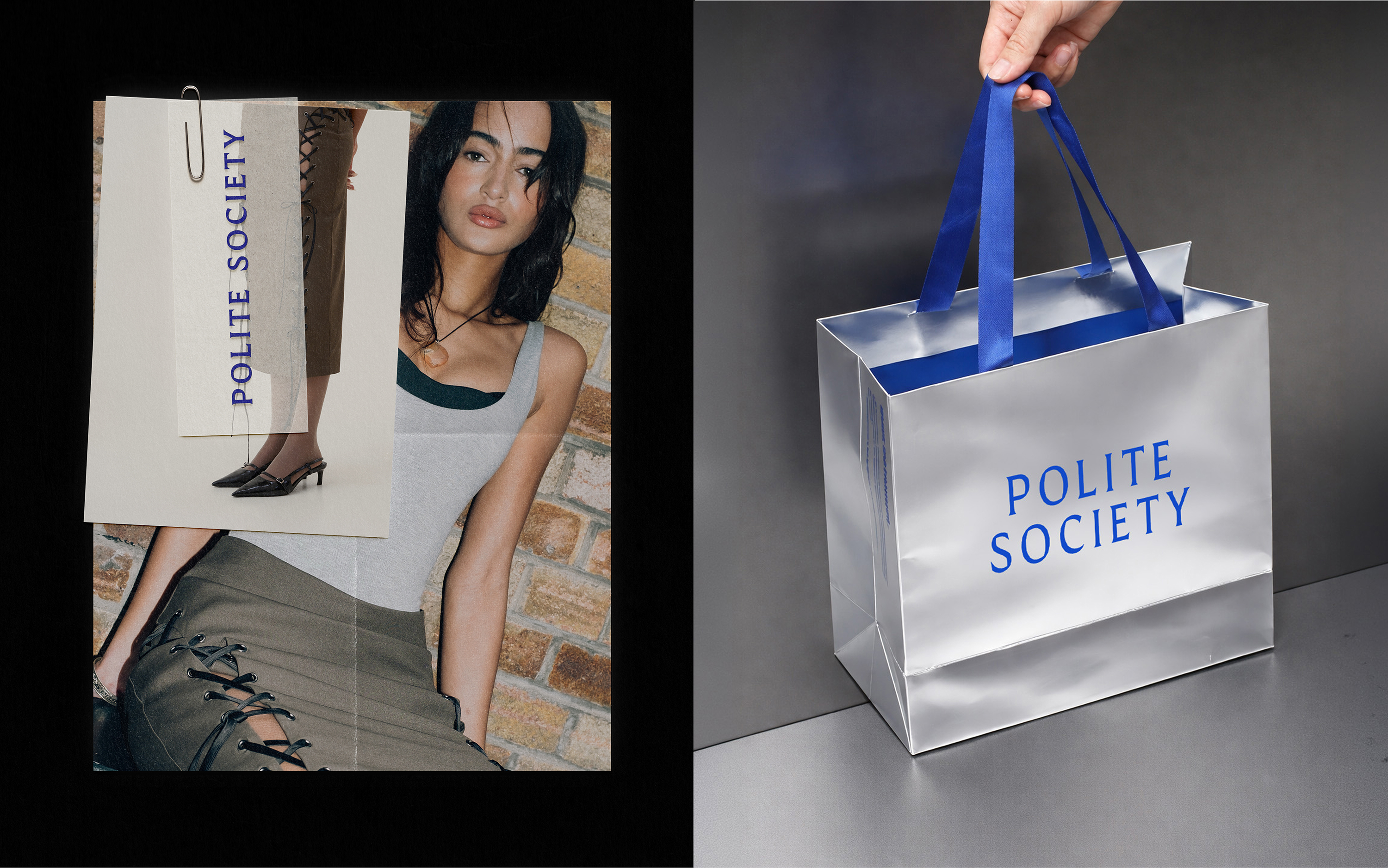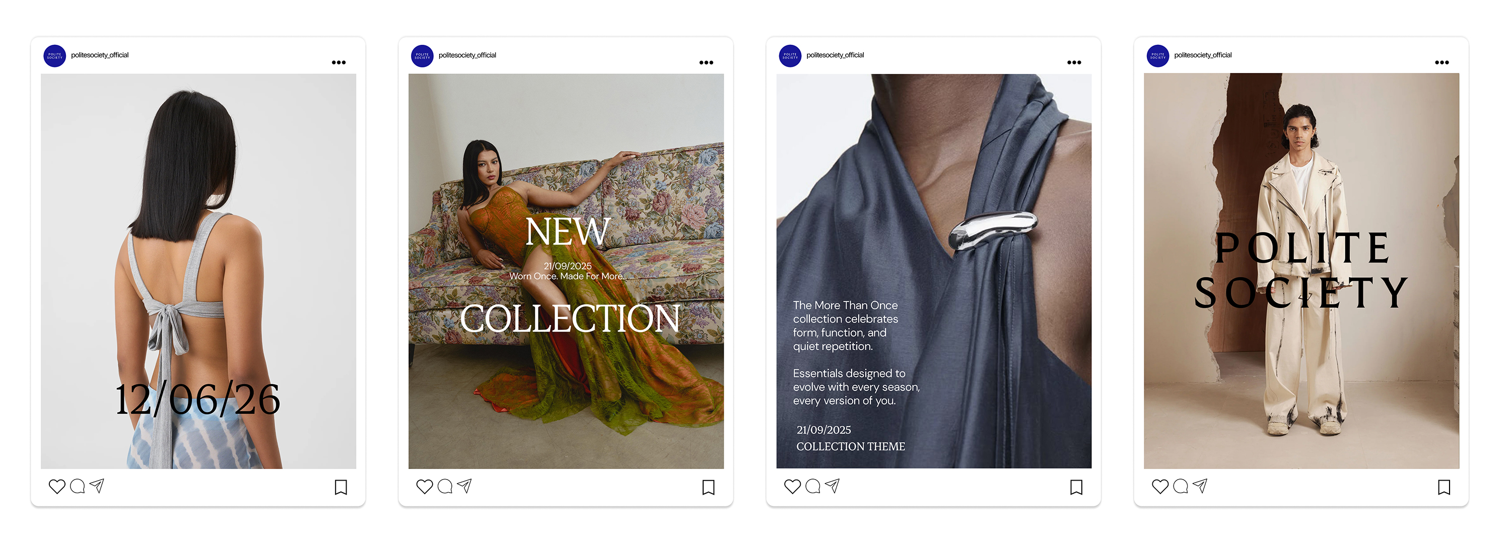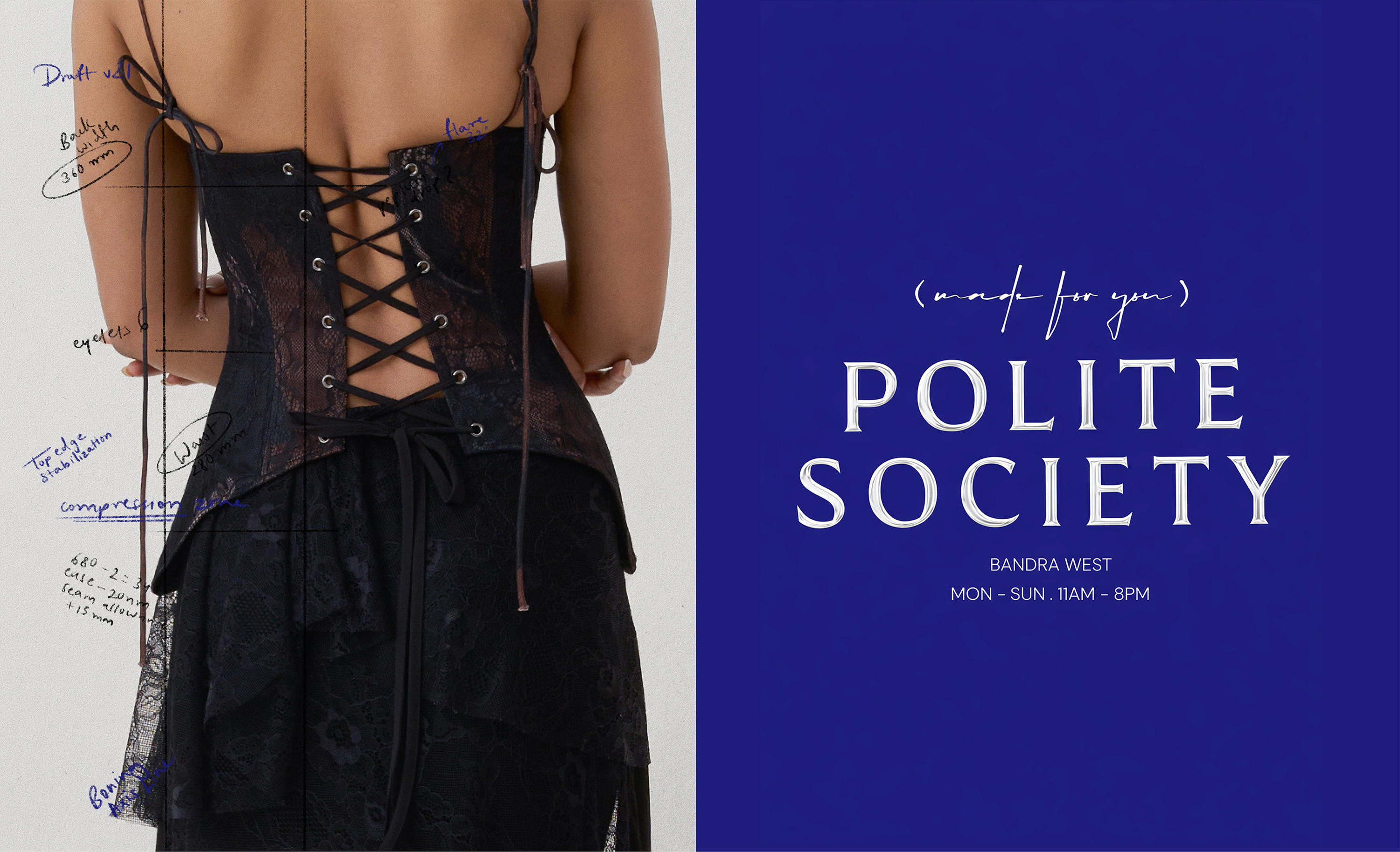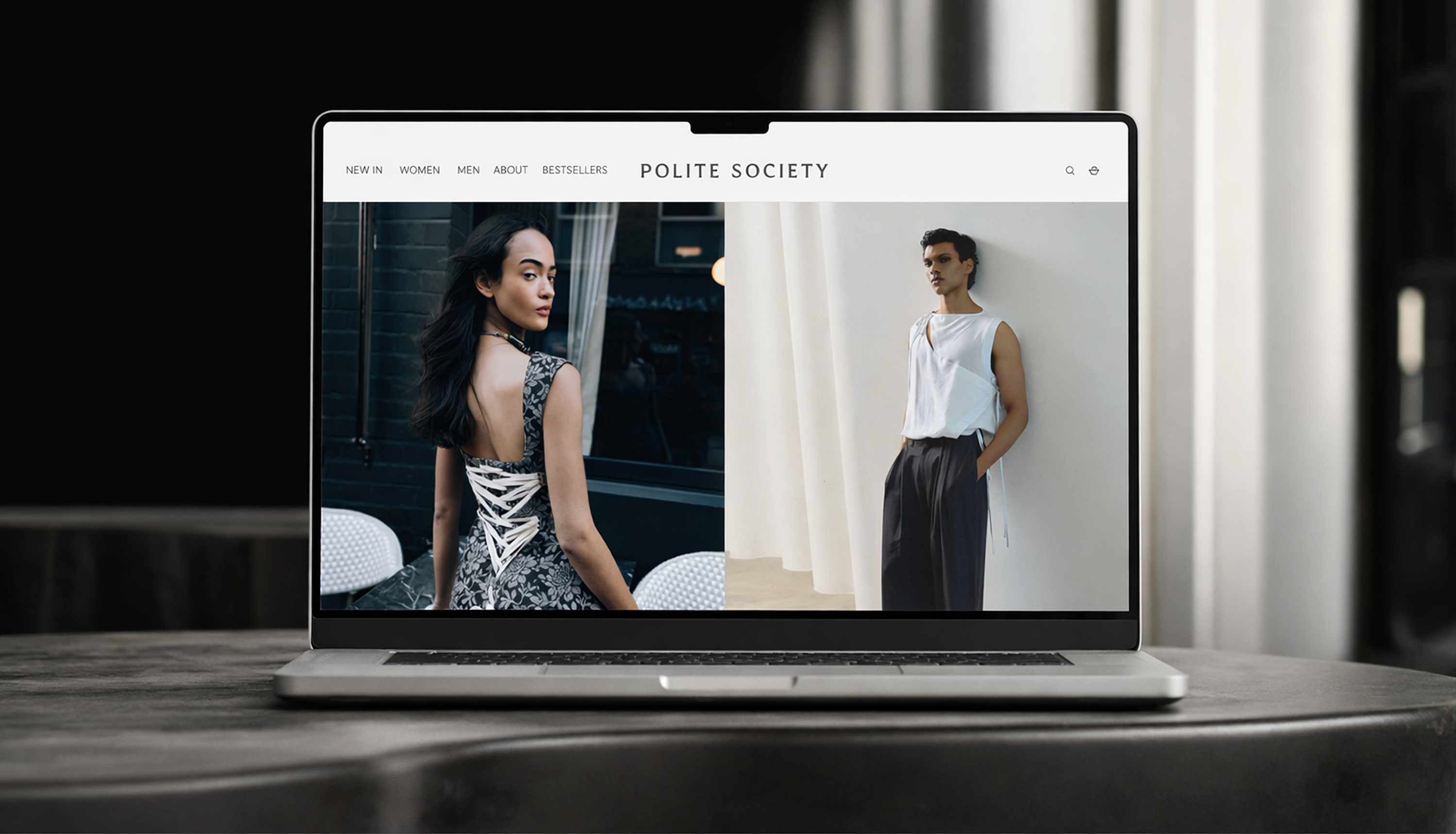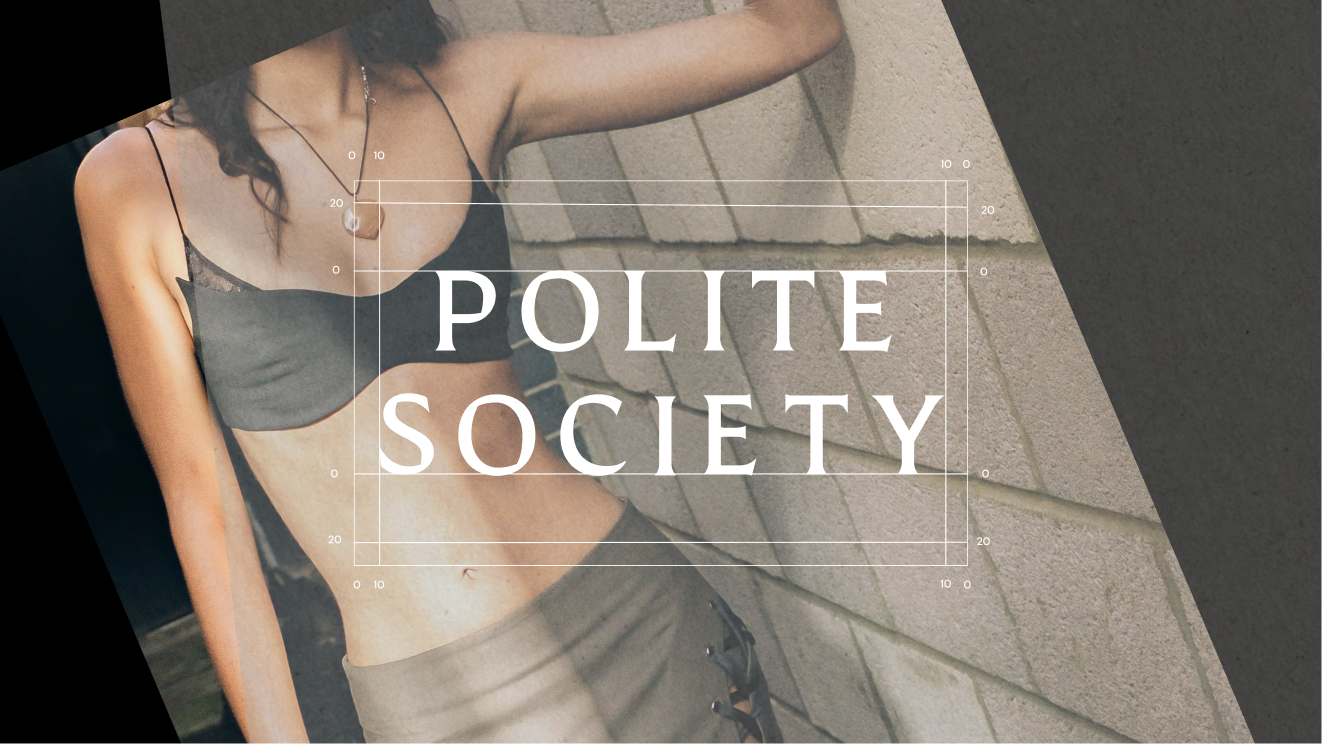
The refresh for Polite Society focused on refining the brand’s core design elements to better reflect its philosophy of sensuality, authenticity and non-conformity. Rather than a full rebrand, the approach was intentionally subtle - strengthening the existing identity while bringing greater clarity and cohesion to how the brand presents itself.
The core brand colour was retained to maintain recognition, while the logo, typography and visual language were refined to feel more confident and contemporary. Clean, editorial layouts with slightly off -balance compositions were introduced to reflect the brand’s balance of elegance and non-conformity.
Alongside the visual updates, a clear design system was developed to guide colour, typography and layout usage across touchpoints. This system establishes a strong hierarchy and introduces distinct visual treatments for different consumer segments and price points, making the identity easier for the brand to apply internally while ensuring consistency externally.